

Incorporating Whimsical Patterns into Furniture with Tone-On-Tone Paint Technique
- Apr 16, 2023
- 5 min read
Updated: Apr 20, 2023
Are you a fan of whimsical furniture, but struggle with incorporating multiple patterns into one piece? Do you find these patterns too busy for your liking?
You are not alone! I hear this often.
In this post, I will help you overcome these issues with a tone-on-tone painting technique.
This post may contain affiliate links. I could make a commission at no charge to you if you purchase my recommended products. Please read my disclosure here and my privacy policy here.

If you are a new reader, hello and welcome to the Fancy Fam! With over a decade of furniture painting experience, I can honestly say that sharing my projects through this blog is still my favorite way to inspire! I've got years worth of fun and creative ways to update your home decor and furniture through paint! If this sounds like something you'd like to have delivered to you every Sunday be sure to sign up for my weekly newsletter here!
Before
I was recently asked by my friend (and the host of the paint retreat) Wana to paint this gorgeous Jacobean Revival China hutch.

She will be using it in her sleek and classy beach house with large windows and lot of natural light. Her decor in this home is a mix of whites, golds and shades of aqua!
I love the natural wood on this piece but she really wanted to use it as a pop of color and personality against her bright white walls.
The Design Plan - Tone on Tone
She requested my whimsical style with a specific request of NO black and white patterns! LOL! "Whimsical but not crazy"....she said!
THIS is where I bring you to "tone-on-tone"!

Tone on tone allows you to use multiple patterns on one piece, keeps it from being too busy, and makes it easy to incorporate into your decor scheme.
Let me tell you how!
Supplies Used
Painters Tape
Plastic Ruler
Washable Pencil

Prepping Furniture
The piece was prepped in my usual way - cleaned well with White Lightning and rinsed twice with water.
It was then painted with two coats of BOSS primer in grey.
Choosing the Right Colors for a Tone on Tone Design
I alway prefer to work with a minimum of three colors.....even when NOT using tone-on-tone.
But when using tone-on-tone like this project, I still choose three colors of the SAME TONE - lightest, mid-tone and darkest.
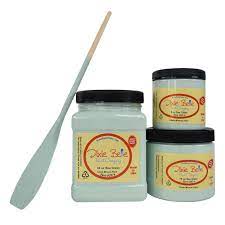
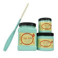
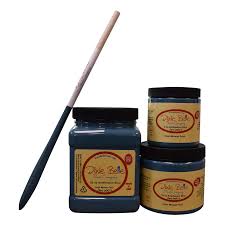
In this case I chose Sea Glass (lightest), The Gulf (mid-tone) and Antebellum Blue (darkest).
I recommend painting the entire piece in your mid-tone color - in this case The Gulf.
I opened a new 16 oz jar of The Gulf and painted the entire piece in a single coat and used just 25% of the jar. This means even an 8 oz jar would still leave you with paint left in your jar! Dixie Belle's chalk mineral paint covers A LOT of area with rich pigmented color!


More Inspiration: Tone on Tone Whimsy
I have been creating with this tone-on-tone whimsical look for years! Here are some of my favorites:
Whimsical Dresser - neutral whimsical white
Whimsical Grunge Bombay - light gray and white neutral whimsy with a grunge vibe
Neutral Harlequin Side Table - soft & subtle
Victorian Damask Queen Bed - stripes on headboard
Neutral Creamy Beige Headboard - a blast from the past! - my most requested design
Adding the Whimsy
It is at this point that I recommend standing back from your piece and laying out your design choices.
This happens pretty quickly for me. Sometimes all at once...and sometimes as I work.
Stripes
I knew I wanted to paint stripes in the bottom center door so I started there. I taped off using my stripe technique and striped with the lighter Sea Glass.

I then introduced the darker tone Antebellum Blue by shadowing in the edges around the stripes. I call this "burying my pattern".
Checks
From there I saw checks in the lower side panels. So, I measured out my checks, drew them, and filled in every other square with the lighter tone Sea Glass.


This created two tone checks that I again buried in with Antebellum Blue edges.
Harlequins
Keeping in the whimsical style, I chose to add harlequin to the top center door.
Again, I measured and drew my pattern, filled in with the lighter shade, and buried with the deepest shade around the edges.

More Stripes!
At this point, I did not want to add a NEW pattern so I brought the stripes (the simplest of the patterns) to the two upper left and right panels using the same techniques as the other pattern for yet another tone-on-tone look!
Paint Blends
I kept the sides of the hutch very simple. The upper side panels I used an ombre blend technique of all three blues and finished it off with a nice spray of water to allow organic drips!

This look is not for everyone but Wana liked it, and it goes well with the beachy vibe and for sure plays into the whimsy!
I finished off the lower side panels with a clean and perfect blend! I worked with the mid-tone The Gulf that was already there, adding Sea Glass to the center as the highlight, and Antebellum Blue to the outer edges as the shadow and depth.


Trim Accent
One of the beautiful features of Jacobean Revival pieces is the carved round post and the gorgeous carved trim! I wanted to accent (but not bury) these with the deep Antebellum Blue.
I made a water-wash or a glaze with the deeper blue.
This is really easy to do and all you need is water and damp rag.
Paint the deep blue watered down paint HEAVILY over the areas you want to accentuate
Then immediately wipe it away with the damp rag to reveal you mid tone color again.
The deep blue will be left in the cracks and deeper areas as you can see on the post here.

I did this exact same thing around the edges of the center drawer, the center round and diamond-shaped appliqués on the door fronts, and those post additions to the lower right and left of the piece.
Final Highlights
The last bit of paint to add was done as a subtle look of salt wash using Sea Glass and an old dry brush. I just lightly dusted all the round post and raised carved areas with the tiniest amount of light paint to give it a salt and sun washed aged look.

And finally...GOLD! I added gold gilding wax by Dixie Belle in a dry brushed technique to areas that I wanted to highlight such as knobs, corners of door trim, and even the lower corners above the gorgeous feet.
The Finished Tone on Tone Whimsical Furniture Look
With two coats of Satin Top Coat, this piece is done! My friend Wana is thrilled and to be honest, so am I! I absolutely love the tone-on-tone whimsy!

This piece is elegant and fun all in one!
More Inspiration: Tone on Tone Whimsy
I hope you are inspired to try mixing patterns in a few of your favorite shades of color!
Here are some of my favorites in different colors and styles for more inspiration:
Whimsical Dresser - neutral whimsical white
Whimsical Grunge Bombay - light gray and white neutral whimsy
Neutral Harlequin Side Table - soft & subtle
Victorian Damask Queen Bed - stripes on headboard
Neutral Creamy Beige Headboard - a blast from the past - my most requested design in my early years!
JOIN ME FOR MORE...with Curiously Creative
If you enjoyed this and want more of a deep dive into home decor and DIY processes, I would love it if you joined my exclusive online creative group, Curiously Creative. I show up LIVE to guide you through every step of updating, upcycling, crafting, and creating on-trend home decor and gift-giving ideas!

Want more fancy furniture & design?

Save & Share on Pinterest!
Please please please share my tone on tone whimsical hutch and follow me on Pinterest!


This is absolutely gorgeous. It is a stunning piece. I hope that she appreciates it. I would love to see what it looks like in its new home.